Mercadona
Mercadona es una gran cadena de supermercados ubicados en España y desde 2016 en Portugal con más de 1646 tiendas y 91000 trabajadores. Es un caso de éxito ya que ha logrado expandirse rápidamente y con bastante solidez.
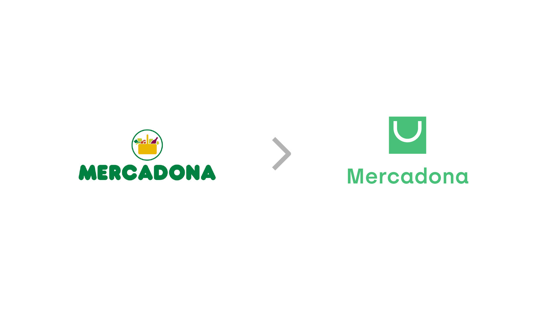
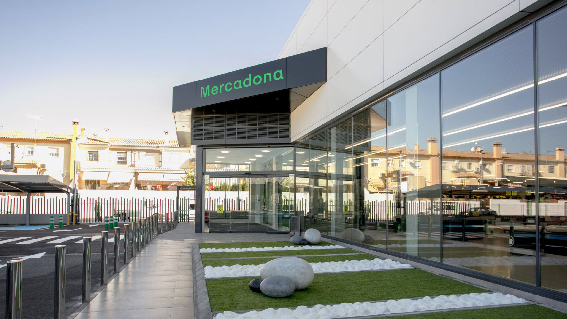
Mercadona tiene muy presente el diseño ya sean con los productos que vende, la organización de sus tiendas y el propio nuevo modelo de tienda que están actualmente implementando pero eso no ha sido llevado a cabo a su imagen de marca que actualmente acusa cierto desgaste y de cara a una expansión a nuevos territorios creo que es necesaria una renovación a nivel visual como de marca
Mercadona are supermarkets located in Spain and since 2016 in Portugal with more than 1,646 stores and 91,000 workers. It is a success story since it has managed to expand rapidly and quite solidly.
Mercadona is very aware of the design, both with the products it sells, the organization of its stores and the new model of store that they are currently implementing, but this has not been carried out due to their brand image, which is currently showing some wear and tear. In the face of an expansion to new territories, I believe that a renewal is necessary at the visual and brand level
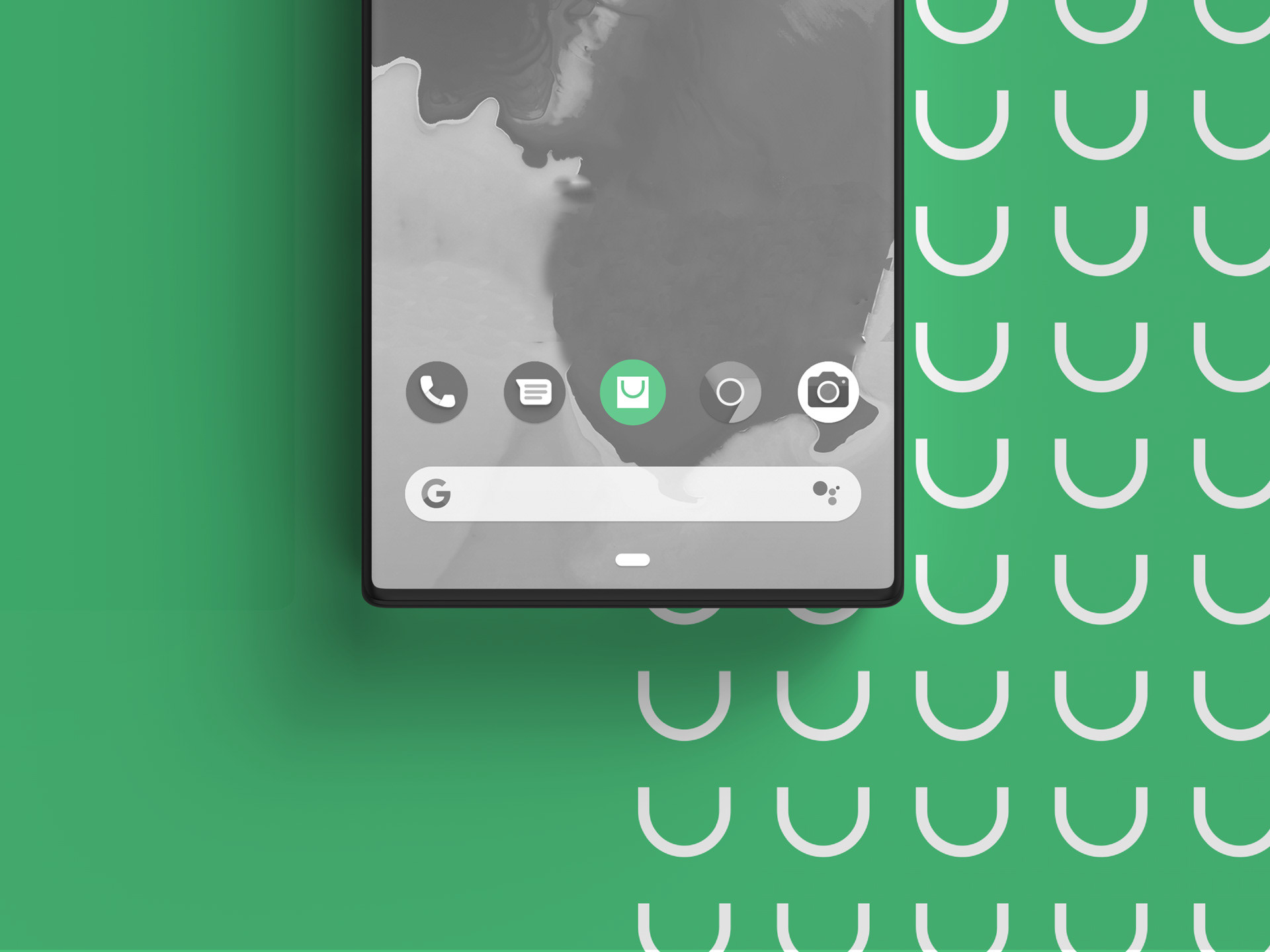
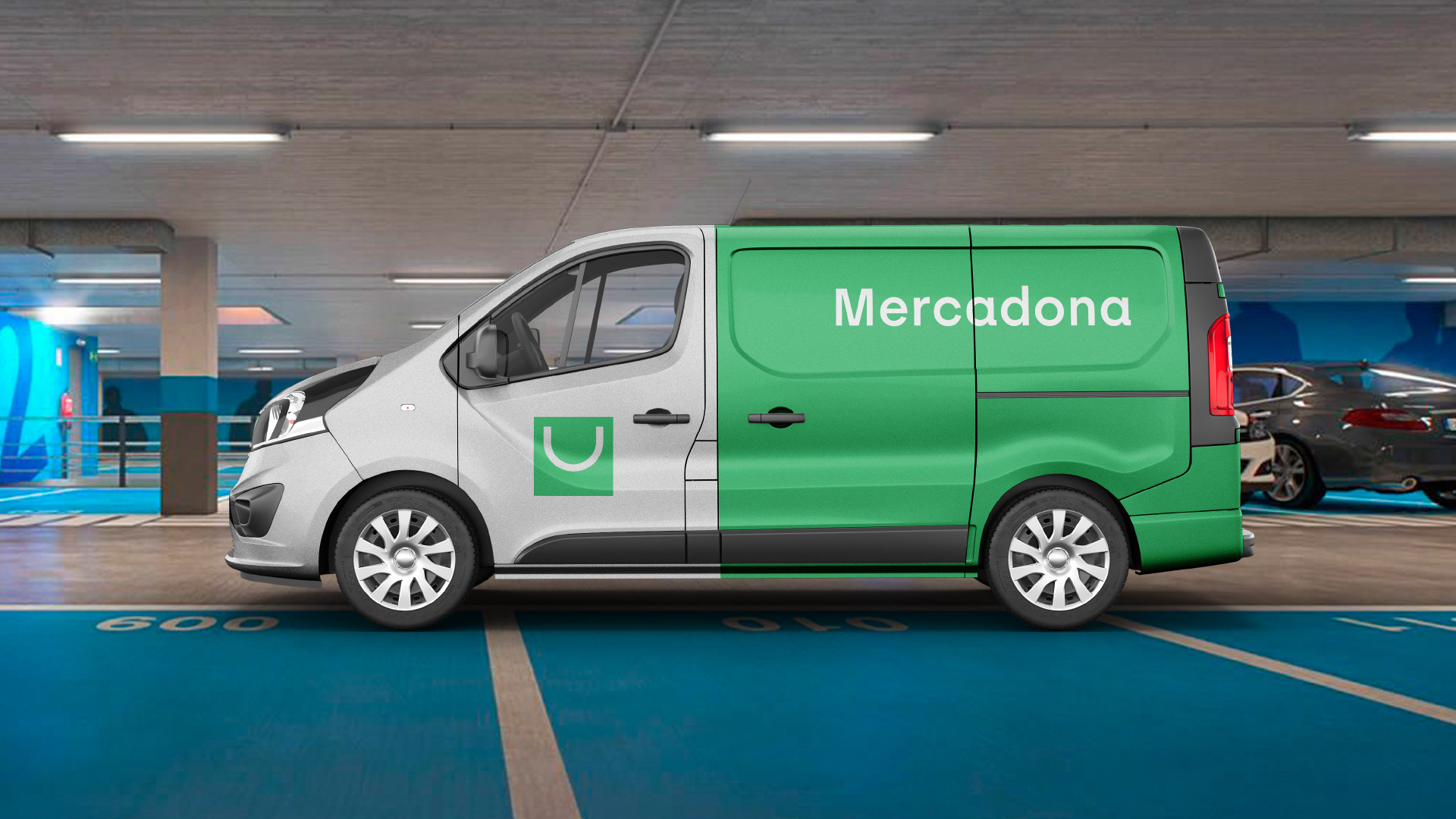
Con el proyecto he querido pensar en la marca para que sea más adaptable a formatos digitales, pero manteniendo la familiaridad y cercanía que caracteriza a la marca.
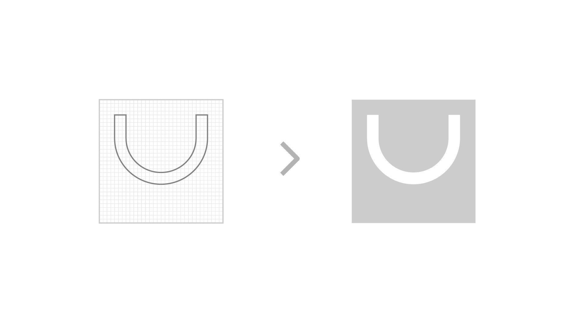
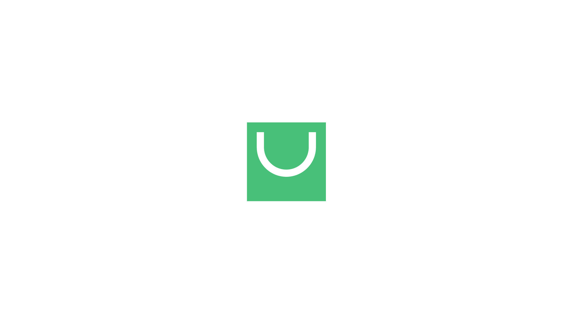
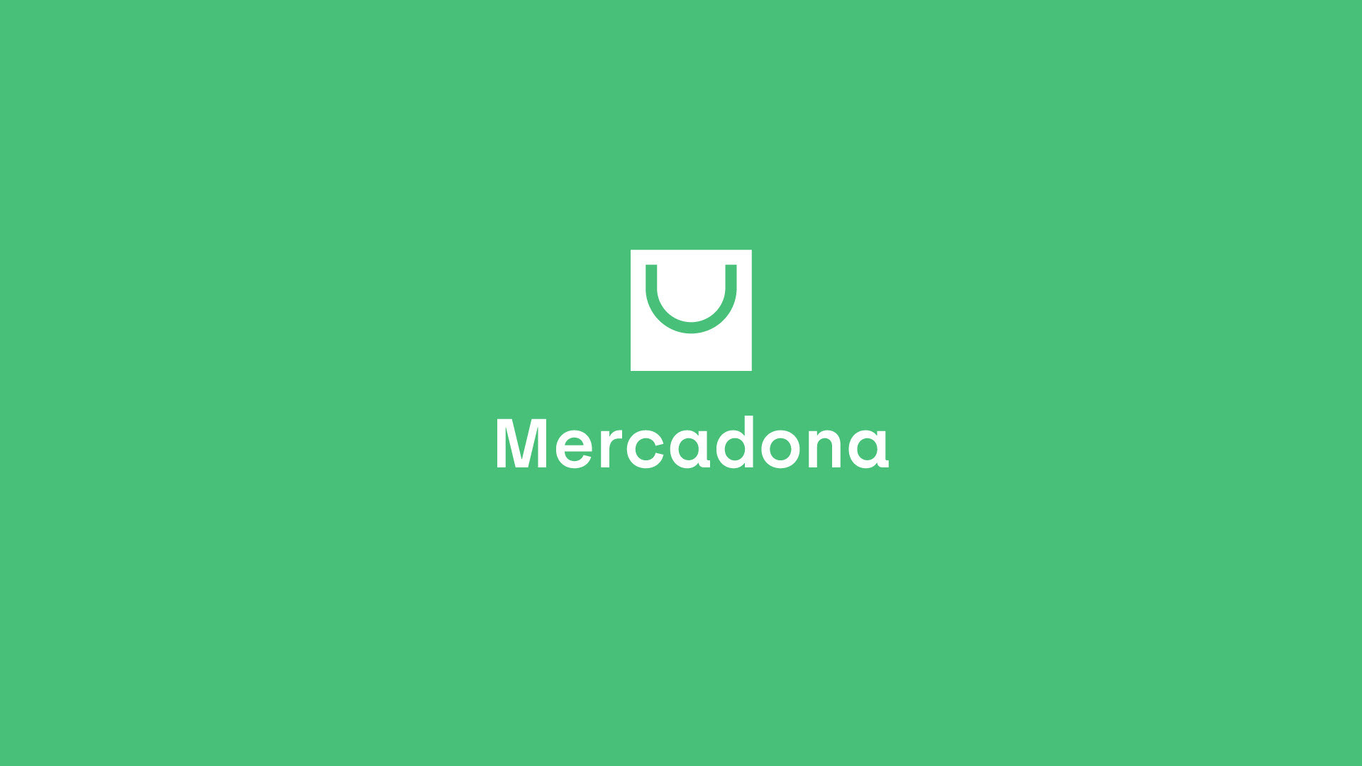
Se ha querido modernizar la cesta que tenía la anterior marca y se ha buscado un símbolo más cercano y que utilizamos actualmente como es una bolsa reutilizable para simbolizar modernidad y respeto con el medioambiente.
La tipografía también se ha actualizado, dejando de lado la Frankfurter y pasando a una tipografía más cercana como es la Archia del estudio Atipo que trabajan en España.
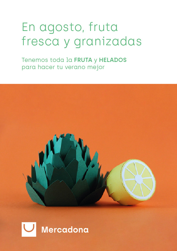
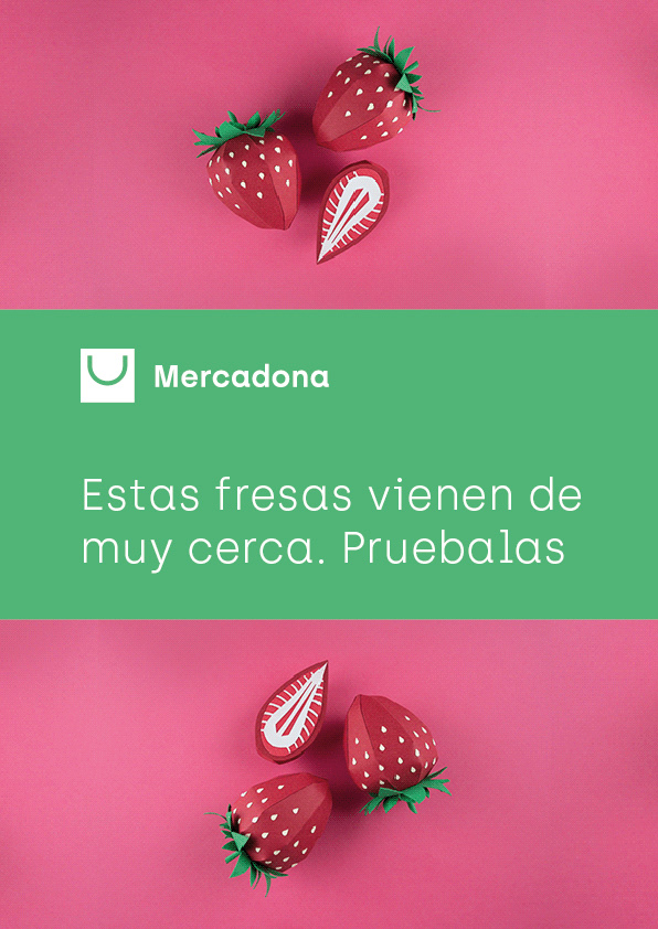
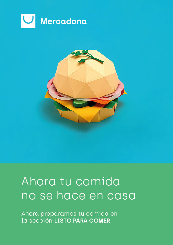
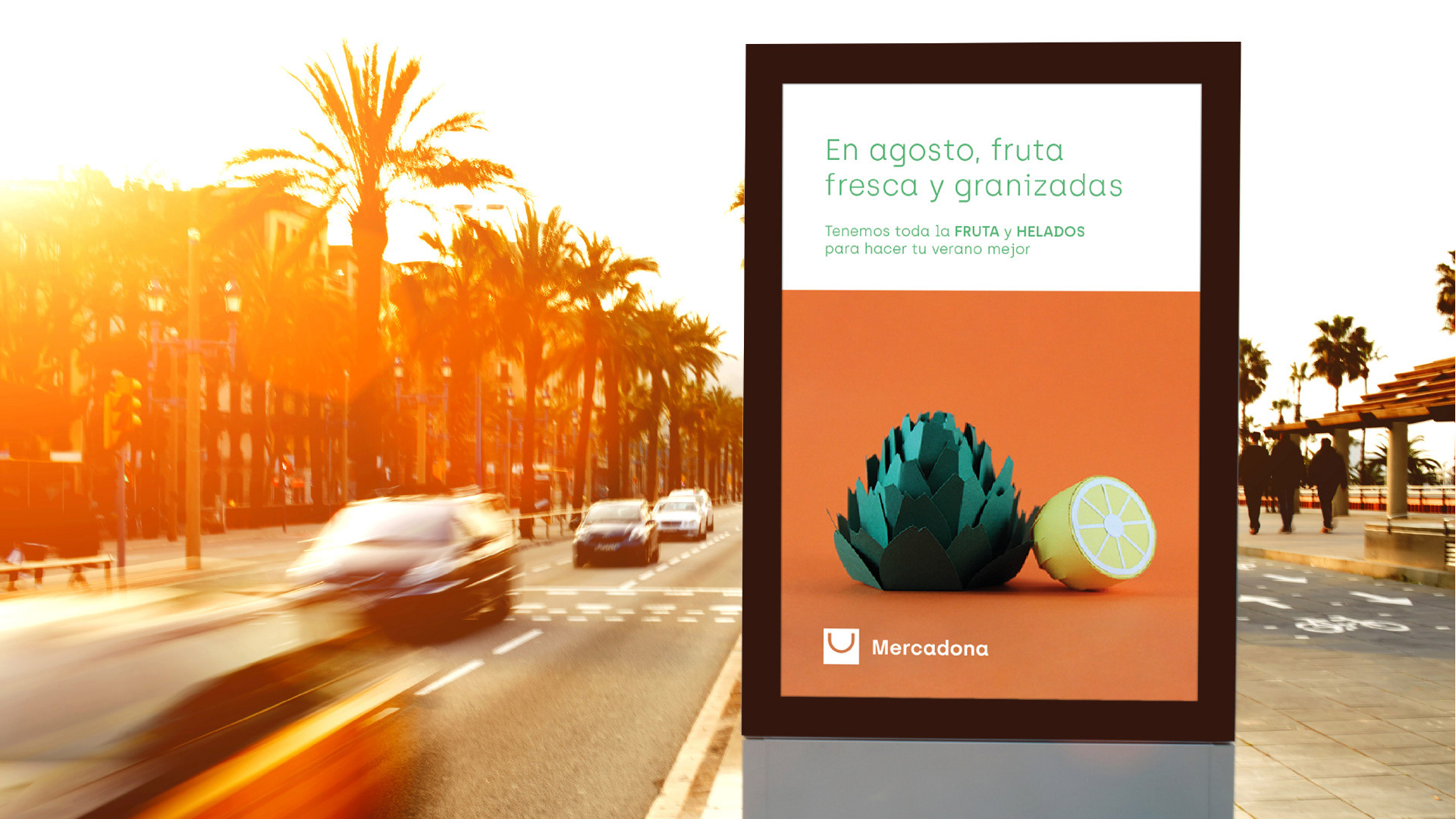
Para terminar y el último punto importante del rediseño y queriendo transmitir familiaridad y a la vez frescura se buscaría realizar un catálogo de imágenes basadas en la técnica del papercraft. Las imágenes utilizadas en este proyecto son de la diseñadora Ary Marín
With the project I wanted to think about the brand so that it is more adaptable to digital formats, while maintaining the familiarity and closeness that characterizes the brand.
We wanted to modernize the basket that had the previous brand and we have looked for a closer symbol that we currently use, such as a reusable bag to symbolize modernity and respect for the environment.
The typography has also been updated, leaving aside the Frankfurter and moving to a closer type such as the Archia of the Atipo studio working in Spain.
To finish and the last important point of the redesign and wanting to transmit familiarity and freshness at the same time, we would seek to make a catalog of images based on the technique of papercraft. The images used in this project are from Ary Marín designer.
Marca - Brand

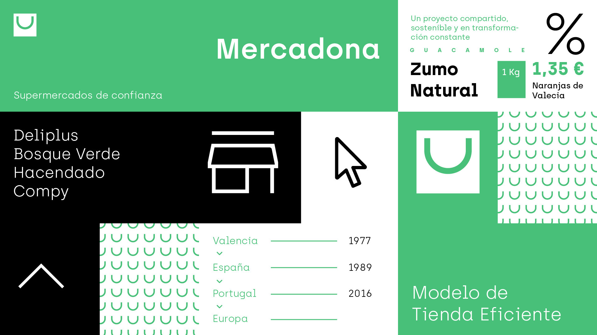
Aplicaciones de marca - Brand application


Este proyecto entra dentro de la iniciativa #BrandChallenge organizado por el Blog Macho dominate