Audacity redesign
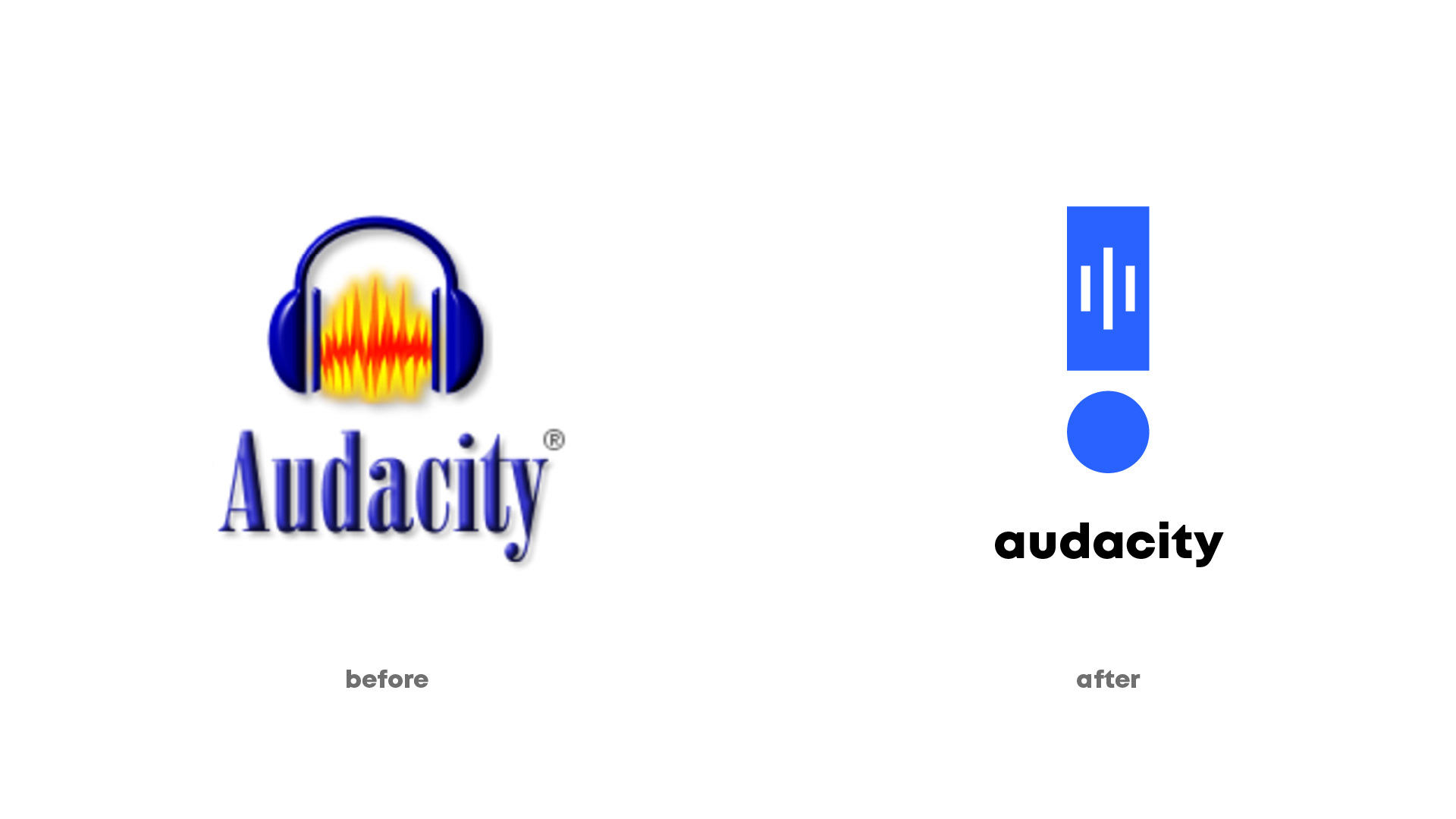
Audacity, es un software de edición de audio lanzado en el año 2000. Es uno de los programas de software libre más populares y presente en Windows, Mac y por su puesto Linux.
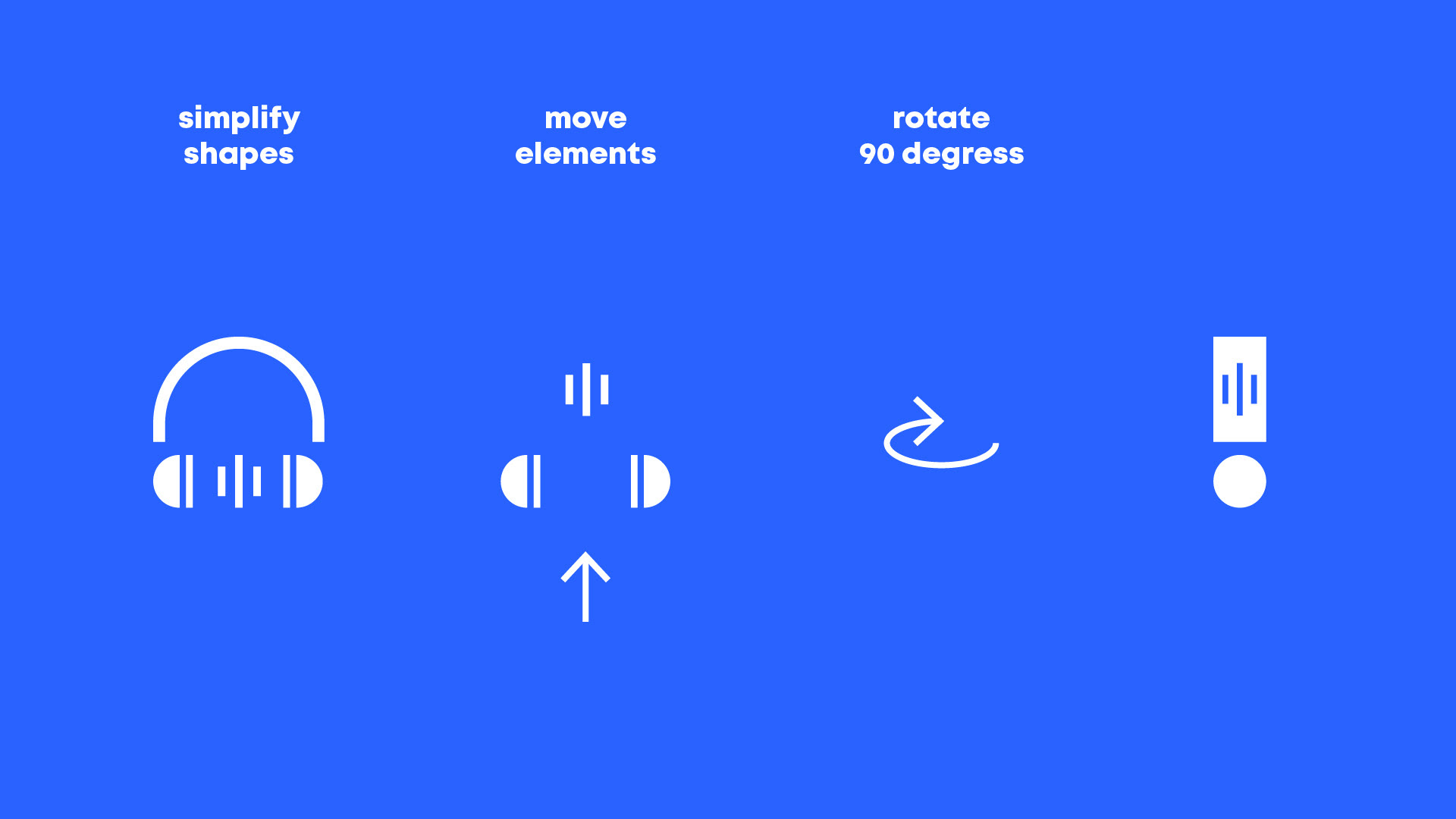
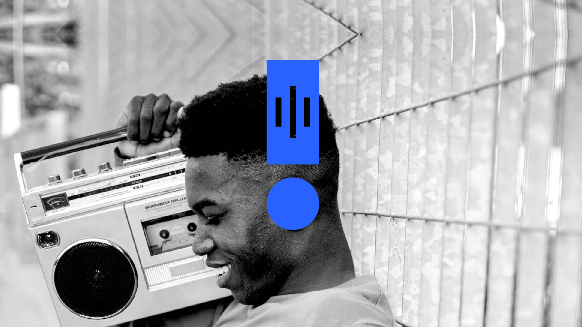
El logo actual nació en 1999 y era necesario un cambio de imagen y de concepto. El concepto actual de logo con unos auriculares y unas ondas no es malo del todo pero hace falta darle una vuelta. Vamos a dársela, rotemos lo auriculares 90º, redistribuyamos los elementos y juéguenos con las proporciones. Solo mantengamos los elementos reconocibles
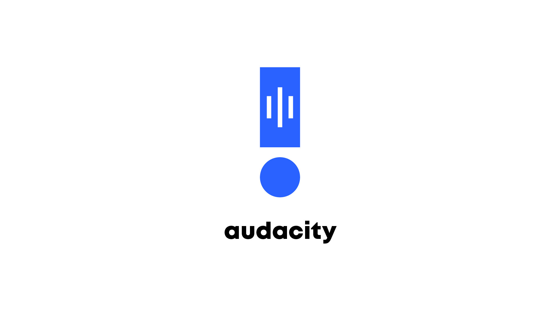
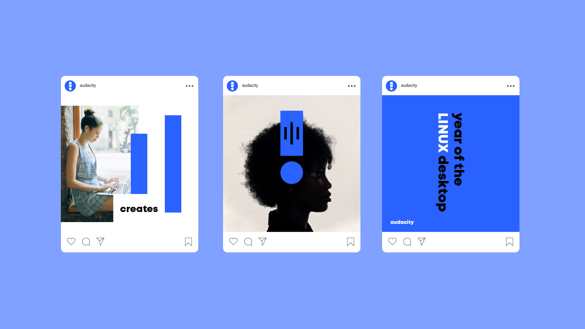
De ese juego de elementos y simplificación surge un nuevo símbolo más fácil de utilizar y reconocible. Comunica lo mismo pero añado en la ecuación un signo de admiración ( ! ) a modo de sorpresa o emoción al editar tu propia música, grabar tu podcast o escuchar tu voz. Jugar con el nuevo símbolo es mucho más sencillo de utilizar e integrarse en publicaciones en postes, publicaciones en redes sociales para reivindicar #audacity como "mi app" y no como "esa app"
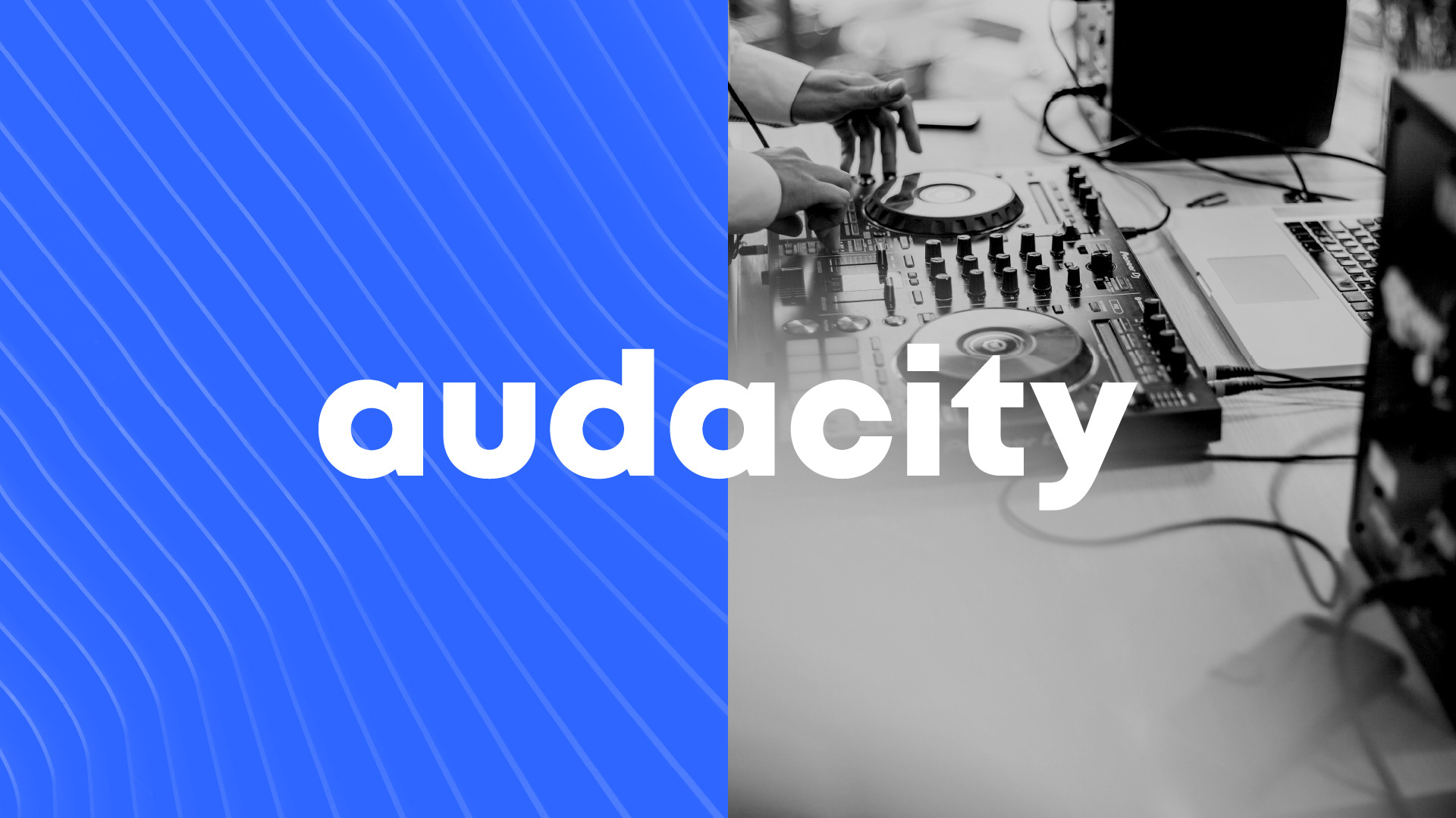
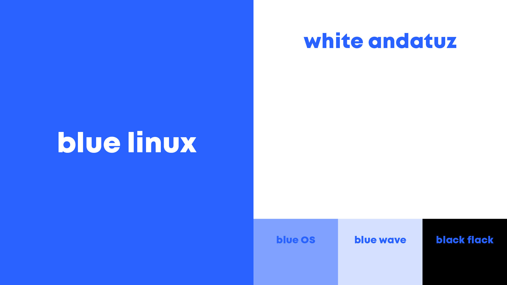
El azul era el color más presente del anterior logo pero era "aburrido" y demasiado serio. Se ha optado por un tono más enérgico para captar a nuevos creadores y pensado para pantallas. Amarillo, rojo y naranja hasta la vista
_________________________
Audacity, is an audio editing software launched in 2000. It is one of the most popular free software programs and present in Windows, Mac and of course Linux.
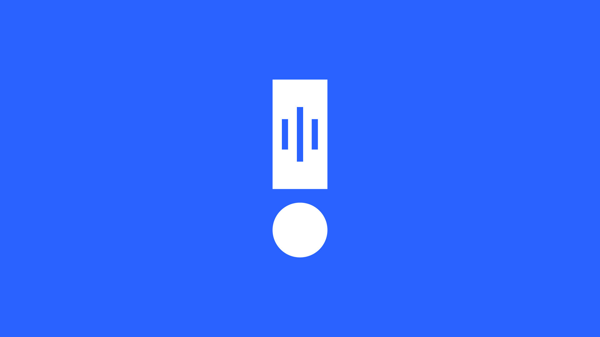
The current logo was born in 1999 and a change of image and concept was necessary. The current concept of a logo with headphones and waves is not bad at all, but it needs to be given a spin. Let's give it to him, let's rotate the headphones 90º, redistribute the elements and play with the proportions. Let's just keep the recognizable items
From this set of elements and simplification comes a new symbol that is easier to use and more recognizable.
It communicates the same thing but I add an exclamation point (!) To the equation as a surprise or emotion when editing your own music, recording your podcast or listening to your voice. Playing with the new symbol is much easier to use and integrate into posts on posts, social media posts to claim #audacity as "my app" and not as "that app"
Blue was the most present color of the previous logo but it was "boring" and too serious. A more energetic tone has been chosen to capture new creators and designed for screens. Yellow, red and orange goodbye